
The Conceptual Artist
/This is part one of a three-part post about Paula Scher’s Citigroup Logo Story
Everybody who’s into graphic design knows about Paula Scher’s famous Citigroup sketch story. Or, at least, should.
In any case, for those of you who have been living under a rock, the story is about how Paula Scher, the undisputed goddess of graphic design, sketched a logo for Citigroup on a napkin and got paid 1.5 million US dollars for it.
It’s also about how she did all that in just a few seconds. Or, as she brilliantly (and truthfully) put it: “a few seconds and 34 years” (cue the mic drop sound here, please).
Here’s the thing, though: has anyone ever heard this story coming from her? Not the “few seconds and 34 years” part.
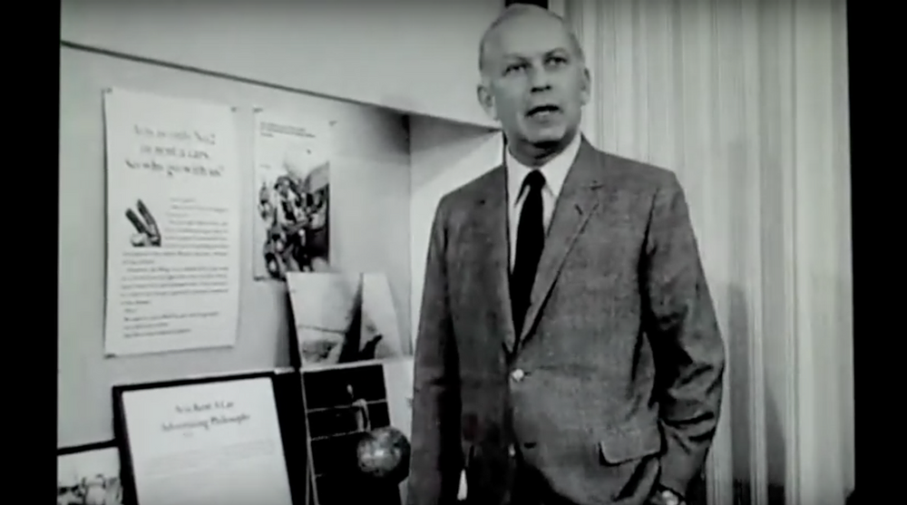
That part can be seen in the video below, in case you want to check it out. She did say it (starts at 3’40”).
I mean, the “1.5 million-dollars-for-a-sketch” part. Has anyone ever heard that part coming from Paula herself?
Or from the folks at Pentagram, the design studio Mrs. Scher is a partner in? Or even from Citibank execs? I know I haven’t. So, I did what most people would. I did my due diligence. I did my homework. I went after that piece of information. And in the end, came out defeated. I couldn’t find it for the life of me.
Here are some of the words I typed during my research, and the number of results I found.
“Paula + Scher + Citi + Sketch”: About 927,000 results
“Paula + Scher + Citibank + Sketch”: About 112,000 results
“Paula + Scher + Citigroup + Sketch”: About 175,000 results
“Paula + Scher + Citi + Logo”: About 21,700 results
“Paula + Scher + Citibank”: About 97,600 results
Obviously, I didn’t go deeper than three pages in on each search (that’s my rule of thumb. It’s like stalking someone on Instagram: three scrolls is the max. ;o)).
So, in actuality, I really only went over a total of 15 pages of Google results. That’s good enough for me.
To be clear: I’m not saying that part of the story is not true. Or that it never happened. I hope it did happen.
In fact, I hope it was more than 1.5 million USD!


But since I couldn’t find a single article or video coming from the parties involved that could corroborate that narrative, for all intents and purposes, from this point forward, every time I bring that part of the story up, I’ll do so while deliberately assigning an urban legend quality to it (plus, let’s face it: urban legends are awesome!).
Ok, moving on.
During my quest to see if the whole “1.5 million USD for a sketch” anecdote checked out, I ended up discovering a bunch of far more interesting things about Mrs. Scher’s career and opinions.
For example, I got to learn about her (super refreshing and incredibly interesting) view on the dangers of success and the importance of staving off complacency.
“I don’t think that success leads you anywhere, because when you’re successful, you tend to repeat those things that you already know how to do and they become terrible crutches. Designers, as they’re producing and making things, cannot rely on past successes, because that is the path to mediocrity. If you make what is ALREADY PERCEIVED AS GOOD, by definition you’re mediocre”, she told ‘OnCreativity’, an ongoing series of short, informal interviews, run by Oregon-based creative studio / magazine Plazm5.
Another thing I learned was that in 1998, she was inducted to The Art Directors Club Hall of Fame, joining other design giants such as:
· Milton Glaser (who invented the “I Heart NY” logo)
· Bill Bernbach (the “B” in DDB Worldwide, the advertising behemoth)
· Lee Clow (the genius behind Apple’s game changing “1984” commercial)
· Dan Wieden (the father of Nike’s “Just Do It” slogan)
· Jim Henson (creator of “The Muppets”)
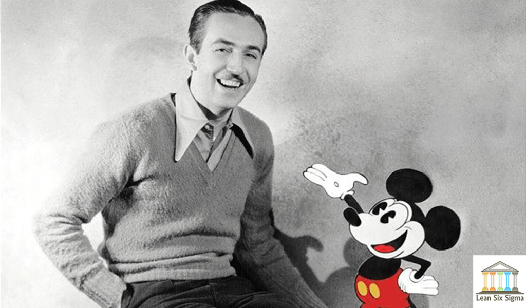
Also keeping her company in the Hall are other somewhat obscure names you might have heard of, like Walt Disney, Andy Warhol, Annie Leibovitz and Issey Miyake. ;o)


What struck me was not the fact that she was in the Hall. It would be just plain criminal if she weren’t.
What caught my eye was the fact that, of all these names I just dropped, she’s the ONLY ONE who was praised for her ability to come up with concepts.
Here’s an excerpt of her full description in the ADC Hall of Fame.
“Paula Scher plunged into the New York design world in the early 1970s (…)
As a student, Scher avoided graphic design because she lacked the necessary “neatness skills” (…)
She didn’t draw well either (…) but she discovered what she could do: COME UP WITH CONCEPTS and illustrate them with type. (…)
In 1991, Scher became a partner in the New York office of Pentagram. (…)
The years at Pentagram have allowed Scher to sharpen her typographic wit and her knack for CONCEPTUAL SOLUTIONS into a powerful approach to identity and branding”.
Coincidence or not, that’s EXACTLY what Curt Cloninger, author of the book “Hot-Wiring Your Creative Process: Strategies for Print and New Media Designers”, called Scher’s logo proposal for the newly formed Citigroup – a conceptual solution (we’ll discuss the logo in more details in the second part of this post).

“I thought graphic design was about being neat. (...) But I found out that it wasn’t about that.
It was about IDEAS.”
All in all, Mrs. Scher has been leaving her mark in the world of design for half a century now.
In 2017, during her talk at “beyondtellerrand”, a design and web development conference, in Berlin, she spoke to the audience about how her career has evolved throughout almost five decades. You can listen to the full version of her talk here.
“In the ‘70s, I was essentially a conceptual art director. (…)
In the ‘80s, I think I was a postmodernist. (…)
In the ‘90s, I was a typographic expressionist. (…)
Then by the 2000 period, I became a minimalist. (…)
Now, in 2010, I would call myself, in this decade, fairly much a visual language designer, which is creating components that collectively you recognize something.
I could not have possibly been working without changing, without adapting to stuff.
It’s not that I change the basic core of who I am, but I did change the way I worked”.
She’s right.
At her core, Mrs. Scher is still that same conceptual artist from the 70s. The same person who discovered – while still in school – that design isn’t about drawing. It isn’t about illustrating. It’s not even about learning how to sketch. It’s about something else. Or, in her own words:
“In the second semester of my sophomore year though, I took a course called Graphic Design! I didn’t know what it was - I thought it was about being neat (…) But I found out that graphic design wasn’t about that, it was about ideas.”
We couldn’t agree more Mrs. Scher.
Sources
1. ADC Hall of Fame http://adcglobal.org/hall-of-fame/paula-scher/
2. Madame Architec https://www.madamearchitect.org/interviews/2020/7/16/paula-scher
3. Eye Magazine http://www.eyemagazine.com/feature/article/reputations-paula-scher
4. Cloninger, C. (2007). Hot-Wiring Your Creative Process: Strategies for Print and New Media Designers. Berkeley, CA: New Riders, p.38.
5. On Creativity https://www.youtube.com/watch?v=foeV4ZML55s
6. Fast Company: https://www.fastcompany.com/57935/wordsmith
7. https://www.nytimes.com/1998/04/07/news/citicorp-and-travelers-plan-to-merge-in-record-70-billion-deal-a-new-no.html
8. Clever Podcast https://www.youtube.com/watch?v=YrBTLw1yPBk
9. Design Interview 1Q: https://www.youtube.com/watch?v=0ddshhUa_VQ
10. Abstract Paula Scher Episode: https://www.youtube.com/watch?v=LCfBYE97rFk
11. https://www.6sqft.com/interview-paula-scher-on-designing-the-brands-of-new-yorks-most-beloved-institutions/
12. beyondtellerrand https://beyondtellerrand.com/events/berlin-2017/speakers/paula-scher


