3-hour drive

Have you guys ever watched a Netflix original series called “Song Exploder”?

It was created and is presented by American musician and composer Hrishikesh Hirway. As I’m writing this post, season number 2 is already on and a total of 8 episodes have been aired so far.

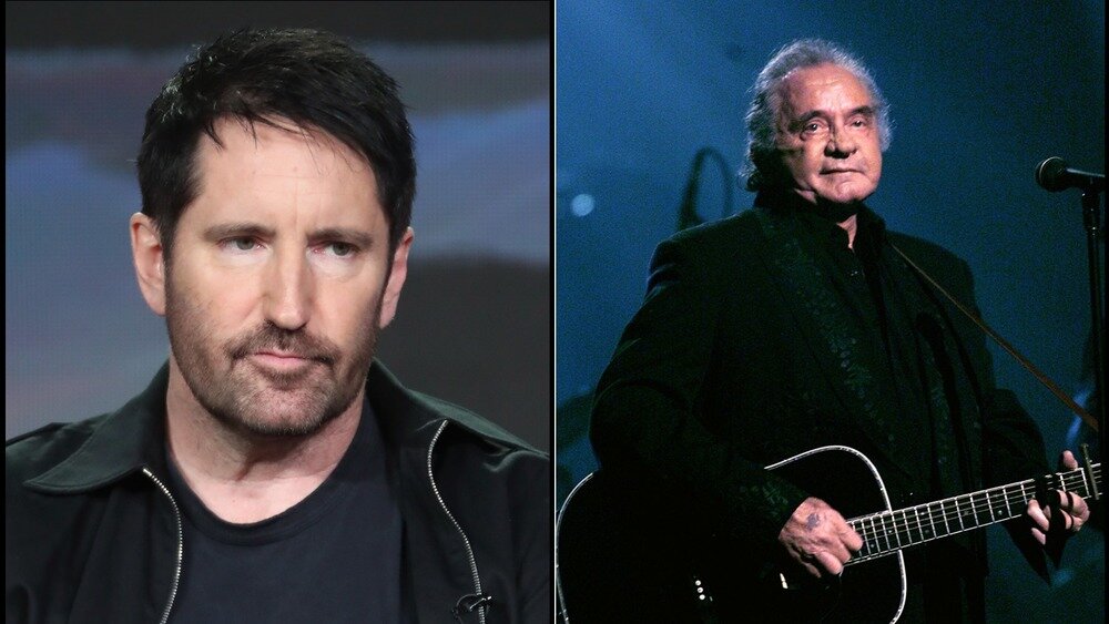
The episodes showcase celebrated artists talking about the creative process behind some of their most well-known and successful songs: R.E.M speaks about the making of “Losing My Religion”, Trent Reznor, of the Nine Inch Nails, reminisces on the production of “Hurt” and Alicia Keys gives us an inside look at the creation of “3-Hour Drive”, which she composed alongside British musician and music producer Sampha.

On this particular post, I’d like to focus on the first episode of the first season, featuring Alicia Keys. There’s a specific scene on this episode that really caught my eye and that I’d like to discuss with you.


Don’t worry: there will be no spoilers, I promise.

It’s a scene where we see Alicia Keys, Sampha and British producer Jimmy Napes right in the middle of the songwriting process. However, it seems like they’re struggling somehow. Creatively, I mean. Almost as if they couldn’t find the right words to fit the lyrics.

Jimmy Napes explains the reason behind that moment of “writer’s block”:


We had these beautiful chords, this beautiful melody, but....NO CONCEPT.
Even though the feeling was there, that’s how songs come together sometimes
”.


The episode continues, as does the struggle, until Napes – who was sitting at the piano – stops playing, turns around, looks at Keys and Sampha directly in the eye and says: “we need to know and think about what we’re saying”.

Keys remembers that moment with a laugh: “Jimmy was like: ‘we need to figure out what we’re writing about’. He’s very practical (laughs)”.

The title of the song is “3 Hour Drive”, and in order to find the concept behind it, the trio started asking the following question:

“Why is the character in the song embarking on a three-hour drive?”

Keys was the first one to raise questions:

Alicia Keys

We knew we liked this “three hour drive”. We liked that, because that was like ‘what does that mean? A three-hour drive?

Where are we going?’”.


Sampha chipped in with his own insights, taking Alicia’s train of thought even further:


Sampha

“The idea of a three-hour drive, yeah, I guess you just have this feeling of someone working through something, you know? There is something super reflective about it. And cathartic”.


Finally, Napes shares his own conclusion with the trio:


Jimmy Napes

I think it’s ‘no you, no me’. There’s no you. There’s no me. You know, that’s like...

YOU GIVE ME LIFE”.


And just like that, the concept was born.

This is what Keys had to say about that moment:

When we landed on You Give Me Life, that was like, a celebration, cause you felt it.
You’re like:
That’s IT.
That’s the THING.
And it’s so simple, but it means so much.
‘You give me life’ means everything
”. 

Ok. This is as far as we go. No more spoilers.

The point I wanted to make is that I didn’t know that when musicians are in the songwriting process, that they would also use concepts. The only instance where I had heard the word concept used in the music industry was when people talked about conceptual albums. And at least to my (very limited knowledge), conceptual albums were strictly recorded by the so-called progressive rock bands, and not artists such as Alicia Keys.

Just to give you and idea of what I mean, some of my favorite conceptual albums of all time include:

  1. Dream Theater’s majestic Metropolis Pt. 2: Scenes from a Memory, released in 1999;

  2. Pink Floyd’s extraordinary The Wall, released in 1979;

  3. and of course, reigning supreme at the top of the list, Pink Floyd’s superb and incomparable The Dark Side of the Moon, released in 1973.

Up until I watched this Netflix documentary series, these were the only – and I mean, only – images my brain was able to conjure up upon hearing the words music and concept used in the same sentence: progressive rock bands performing never ending solos, playing 20 minute songs and singing about things like “the decadence and idiosyncrasies of the human condition”. ;o)

That’s why it was incredibly invigorating to learn how musicians – any musician – also need concepts in their creative process.
It was refreshing to see how, in the episode, everything about the song started making sense once the concept was found.
And it was cathartic to be able to realize that the concept started coming into play as soon as the trio asked:

“Why”?

“Why does one embark on a 3-hour drive?”

What is the purpose of this trip?
Where are we heading?
Are we running away from something?
Which thoughts will make us company during this 3 hour drive?

We’ve already learned that asking the right questions give birth to some of the best concepts.
And in this case, all questions could be summed up in one: “Why are we going on this trip?”.  

It’s that old adage: with concepts, there’s ALWAYS a reason-why.
And in the case of “3-hour drive”, it’s no exception.
There’s a reason-why.

But I can’t tell you what it is because I promised I wouldn’t give out any spoilers.

Instead, I suggest you guys drop everything you’re doing, join Alicia Keys, Jimmy Napes and Sampha on this amazing episode and find out for yourselves.

I promise you won’t regret it.

Have a nice trip!

The Conceptual Value

This is part three of a three-part post about Paula Scher’s Citigroup Logo Story

During a conversation with Design Interview 1Q, in April 2020, Paula Scher was asked the following question:

“What is design for you?”

This was her reply.

 
Paula scher

Paula scher

 
What I do as a designer is really to make things recognizable and understood.
I’m creating some sort of spirit that people can recognize and associate it with something that gives it a particular meaning.
— Paula Scher
 

I can’t help but wonder if what Scher calls “spirit” is actually the “concept” behind each and every one of her works. I like to think it is. Well, in my heart of hearts, I know it is.

Because that’s what concepts do: they give life to what was otherwise just form and matter. And by doing so, they help us recognize and understand the world around us.

1.     To be seen as more than just form and matter.
2.    To be recognized.
3.    To be understood.

Have any of you guys ever felt like that? Like you were really, truly seen. Fully recognized. Completely understood.

In other words, have you ever felt like you actually matter?

If you have, well, then you are part of a very, very, VERY exclusive club. Because most of us haven’t. In fact, most of us spend an entire lifetime chasing that feeling, trying to experience it. Unfortunately, to no avail.

Now, what if someone could help us end this lifelong search in a matter of seconds?
How much would you be willing to pay for it?

Going back to Scher’s sketch, apparently, to the folks at Citigroup, the answer was 1.5 million US dollars.

Was that fair?
Too expensive?
Or a total bargain?


Before we try to answer that, let me ask you this.

Who here has ever watched the 1998 film “You’ve Got Mail” (yes, I’m a sucker for romantic comedies), starring Tom Hanks and Meg Ryan?

It’s based on another rom-com, starred by the same couple of actors, “Sleepless in Seattle” (1993), in which the protagonists exchange letters instead of emails.

On a personal note, here’s to the brilliant, late Norah Ephron, who directed both films: thank you. Thank you for bringing extraordinary joy to our very ordinary lives.

And for giving us all more reasons to smile, and - most importantly - more reasons to believe in love. ;o)

tileburnedin.jpg
 

Ok, back to the subject at hand.

There’s a scene where Tom Hanks (who plays Joe Fox, the owner of a chain of mega bookstores) and Steve Zahn (who plays an employee of ‘The Shop Around the Corner’, an independent bookstore owned by Meg Ryan) are going over this children’s book, which is carefully and completely illustrated by hand.

Zahn’s view is clear: this is a not a book. It’s a work of art.
These illustrations are not accessories to the story; they’re a testament to the author’s commitment to the craft of writing a children’s book.
This is not something that belongs in the hands of merchants (who deal merchandise based on their cost) but rather in the realm of marchands (who deal art based on their value).

Hanks’ view is Zahn’s polar opposite.
As a businessman, and as the owner of a chain of mega bookstores, to him, that is exactly what a book is: a merchandise.

Their different, opposing views clash in the scene below.


The dialogue starts at 2’42”.

Steve Zahn: The…huh…illustrations are hand tipped.
Tom Hanks: That’s why it costs so much?
Steve Zahn: No. That’s why it’s WORTH so much.


Here’s where the clash stems from:

Tom’s character is talking about PRICE.
Zahn’s character is talking about VALUE.

Two COMPLETELY different things.

But that, in the world we live in, as we know it, MUST coexist.
And the trick is to find this common ground.


So, going back to the question: 1.5 million USD to help a global financial organization experience the most elusive of feelings, vicariously through a conceptual brand identity – sketched in a matter of seconds –, by someone with 34 years of proven record.

Is that fair?
Too expensive?
Or a total bargain?

My super-financially-ignorant self wants to say it was a total bargain (I mean, come on: we’re talking about a 70 Billion USD deal here, for crying out loud…;o)).
All jokes aside, honestly, I don’t think I know the answer. I don’t even know if there’s ONE right answer. 

But I do know something that I’d like to share with you and that might shed some light on the issue.

At the very beginning of her Netflix Abstract Episode (6’40” - 7’36”) Scher said:

 
Typography can create immense power. (…)
Before you even read it, you have sensibility and spirit. And if you combine that with a MEANING, then that’s spectacular!
— Paula Scher
 

With that in mind, maybe the question should not about how much an idea might cost and how our clients might feel about it.
Maybe the question we should be asking any client who requests a concept from us is this:

Is the feeling of being seen, recognized and understood WORTH to you?
If so, how much does it MEAN to you?

By definition, a concept is an abstraction. In that sense, it’s understandably hard to assign a fixed, exact number to something so complex and immaterial.

However, creative industries (and the world we live in, for that matter) are designed to operate within economic rules, so money will always be part of the conversation. Which means that whenever we’re creating a concept for a client, at some point, like it or not, we will inevitably need to talk about PRICE.

But how does one price a CONCEPT (which is, essentially, an IDEA) in the first place?

Most importantly, how does one do it in a just, fair and equitable manner?

Those are legitimate questions.

From the very first moment creativity became the backbone of an entire “industry”, clients and creatives have been going back and forth at it, trying to answer them, struggling to figure out the best way to price all kinds of intangible assets and intellectual capital: from music composition and screenwriting to advertising concepts and design ideas. 

image_1611234002.jpg

We’ve tried hourly-based pricing.
We’ve tried project-based pricing.
We’ve tried monthly fees.
We’ve tried performance-based pricing.
We’ve tried art commissioning.
It seems like we’ve tried it all.

Still, we can’t agree on which is the most just, fair and equitable pricing model for BOTH parties (I’m not sure if such a thing is even possible in a capitalist market, but anyway…).

It’s ok though. We’ll keep trying. I know I am. For years now, I’ve been growing a ridiculous amount of grey hair trying to solve this puzzle. In case you’d like to learn a bit more about how I believe ideas and concepts should be priced, I sincerely recommend you guys read the following books.

The first one talks about the value of things that… well, are invaluable, such as knowledge.
The second discusses the difference between the value of strategy (intangible) and execution (tangible).
And the third is self-explanatory.


For now, how about if we all agreed on the fact that some things just can’t be priced?
Think about it. It’s true, right?

Some things, even though they’re extremely and undeniably valuable, simply can’t be priced.

Like spending time with our kids.
Or having good health.
Or feeling like your identity (be it as a person or a brand) really, truly matters to someone.

Maybe that’s the case with concepts and ideas. They possess immense value and create even greater value. And yet, somehow, some way, they just simply can’t be priced.

Wait. You know what? I think there’s a word for that…. Yes, of course there is.

No, it’s not “free”.

It’s “priceless”.


Sources

1. ADC Hall of Fame http://adcglobal.org/hall-of-fame/paula-scher/
2. Madame Architec https://www.madamearchitect.org/interviews/2020/7/16/paula-scher
3. Eye Magazine http://www.eyemagazine.com/feature/article/reputations-paula-scher
4. Cloninger, C. (2007). Hot-Wiring Your Creative Process: Strategies for Print and New Media Designers. Berkeley, CA: New Riders, p.38.5. On Creativity https://www.youtube.com/watch?v=foeV4ZML55s
6. Fast Company: https://www.fastcompany.com/57935/wordsmith
7. https://www.nytimes.com/1998/04/07/news/citicorp-and-travelers-plan-to-merge-in-record-70-billion-deal-a-new-no.html
8. Clever Podcast https://www.youtube.com/watch?v=YrBTLw1yPBk
9. Design Interview 1Q: https://www.youtube.com/watch?v=0ddshhUa_VQ
10. Abstract Paula Scher Episode: https://www.youtube.com/watch?v=LCfBYE97rFk
11. https://www.6sqft.com/interview-paula-scher-on-designing-the-brands-of-new-yorks-most-beloved-institutions/
12. beyondtellerrand https://beyondtellerrand.com/events/berlin-2017/speakers/paula-scher

The Conceptual Logo

This is part two of a three-part post about Paula Scher’s Citigroup Logo Story

In the last post, we ended on Curt Cloninger’s book, “Hot-Wiring Your Creative Process: Strategies for Print and New Media Designers”.

I highly recommend it. For real. It’s really insightful. Incredibly easy to read. And it focuses on one of the most complicated, intriguing and yet, coolest and most exciting subjects known to man: creativity. I’ll leave the link here, so you can download the pdf for free, ok? But in case you don’t feel like reading the whole thing, then at least take a few minutes to read the pages I’m posting below.

Here’s why: the book has 254 pages, organized into 10 “major chapters” that cover about 50 different topics that somehow, to some degree, make up the fabric of what we call creativity. One of these topics is titled OVERVALUE THE CONCEPTUAL (needless to say, it’s my favorite topic of the book! ;o))

Well, here are the words the author chose to open up this topic.

Overvalue the conceptual. If I had to give just one piece of advice, THIS WOULD BE IT.
You can’t value the conceptual enough.
— Curt Cloninger

I mean, come on. If an introduction like that doesn’t make you dive into the pages below, then I don’t know what will.

The post continues right after the pages below. For now, I’ll leave you be so you can read them and I see you in a bit, ok?

Pretty awesome, right?

Now, let’s go back to what Cloninger said about Scher’s Citi logo, shall we?

Citicorp and Travelers Group insurance had merged. And their new logo needed to combine aspects of each of their previous identities — the letters citi and the red travelers group umbrella — in a way that didn’t seem like a logo train wreck. Scher arrived at a simple CONCEPTUAL SOLUTION to a complicated design challenge.”

Hard to argue with him. He’s right. Absolutely right. But here’s the million dollar question: what exactly is a conceptual solution?

I bet if you ask a hundred people that same question, you’ll get a hundred different answers. And truth be told, I don’t even have ONE final, definitive answer, so I’ll just give you my two cents here instead, ok?

To me, conceptualizing has to do with simplifying things so that we may understand them better; or at all.

Everyone does it differently. The way I do it is by asking questions.

I ask questions.
And I ask questions.
And I keep asking them until I get to the point where I am able to recognize that I finally tapped into the TRUTH OF THE MATTER.
When that happens, things suddenly make sense, everything clicks and I’m in peace with the concept at hand.

In the case of the Citigroup logo, the truth of the matter was that when financial giants Citicorp and Travelers Group merged, it was a “politically fraught corporate merger”.

Mrs. Scher understood that.

She understood the stakes were super high (according to The New York Times and The Wall Street Journal, the merger was the result of a deal valued between USD 70 and USD 83 BILLION).
She understood that there were a lot of people involved in this operation.
And she understood that, as far as the new Citigroup identity was concerned, it was her responsibility to do right by these people.

Or, as she wisely stated in her 2019 Netflix Abstract Episode, “design needs to take human behavior into account”.

In this case, it was the behavior of two humans in particular: Sanford Weill (chairman an CEO of Travelers Group) and John Reed (chairman and CEO of Citicorp).


I know that there are people within corporate hierarchy whose opinions matter and they will determine what’s going to be done and not done”, Scher said on episode 104 of the Clever Podcast.

In other words, she knew from the get-go that, at least internally, the logo had to achieve one very specific goal: it had to reflect the merger EQUALLY.

If you’re wondering if she succeeded at that or not, here’s a fun test: take a look at Scher’s Citi logo below and try to pinpoint which of the two former companies received “preferential treatment”. Citibank or Travelers Insurance?

You can’t tell, right?

That’s because Mrs. Scher achieved the aforementioned goal with honors, by simply using the “t” in Citi (which was written in lowercase) as the handle for the old Traveler’s Insurance umbrella. It was an exceptionally brilliant solution, and an extremely conceptual one as well.

 
ps-citibank-01.jpg
 
I’m allowing my subconscious to take over, so that I can free associate. You have to be in a state of play to design. If you’re not in a state of play, you can’t make anything.
— Paula Scher
 

The concept behind Scher’s logo was that, with the merger, the market would now have a “one-stop-shop” for financial products.

From credit cards and checking to insurance and investing, Citigroup now offered an umbrella of services, under which consumers would have access to Citicorp’s strengths of traditional banking and consumer finance, along with Travelers’ long experience in providing insurance and brokerage services. 

During an interview in 2017 with 6sqft, an arm of CityRealty (a real state website), Mrs. Scher stated that “my goal is to make things last”.

Given the number of years Citigroup’s logo has been going strong (two decades and counting), all over the globe, without a single change or tweak, I believe it’s safe to say she’s achieved her goal.

There’s a reason why I believe the brand identity she created for Citigroup has stood the test of time: it’s because on that particular day, back in 1998, when Mrs. Scher grabbed that napkin after a meeting and started drawing on it, she didn’t just come up with a sketch. She came up with a concept.

And concepts, as we all know, are timeless.


Sources

1. ADC Hall of Fame http://adcglobal.org/hall-of-fame/paula-scher/
2. Madame Architec https://www.madamearchitect.org/interviews/2020/7/16/paula-scher
3. Eye Magazine http://www.eyemagazine.com/feature/article/reputations-paula-scher
4. Cloninger, C. (2007). Hot-Wiring Your Creative Process: Strategies for Print and New Media Designers. Berkeley, CA: New Riders, p.38.5. On Creativity https://www.youtube.com/watch?v=foeV4ZML55s
6. Fast Company: https://www.fastcompany.com/57935/wordsmith
7. https://www.nytimes.com/1998/04/07/news/citicorp-and-travelers-plan-to-merge-in-record-70-billion-deal-a-new-no.html
8. Clever Podcast https://www.youtube.com/watch?v=YrBTLw1yPBk
9. Design Interview 1Q: https://www.youtube.com/watch?v=0ddshhUa_VQ
10. Abstract Paula Scher Episode: https://www.youtube.com/watch?v=LCfBYE97rFk
11. https://www.6sqft.com/interview-paula-scher-on-designing-the-brands-of-new-yorks-most-beloved-institutions/
12. beyondtellerrand https://beyondtellerrand.com/events/berlin-2017/speakers/paula-scher