Don’t worry about looking authentic.
Focus on what authenticity looks like.
Do it your way.
Everyone judges a book by its cover.
But what if there was no cover? Better yet, what if the cover’s been blown?
You’ll still be judged. But for what’s inside. Your story. Your narrative. Your style.
And then, you’re no longer a cover. You’re an original.
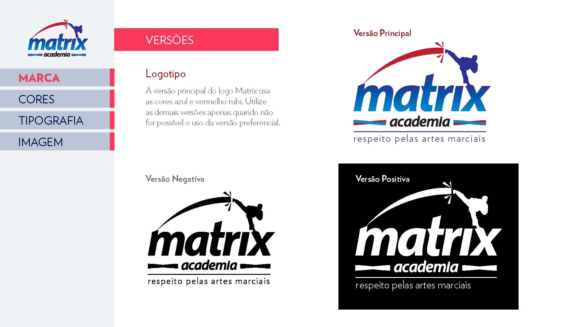
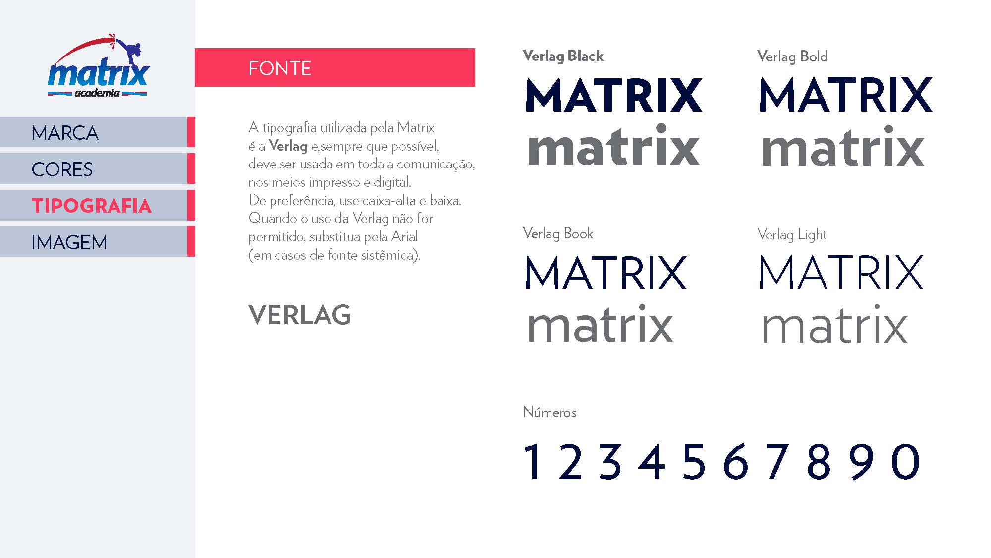
Matrix


Context
After repositioning itself as a martial arts club, as opposed to a regular sports gym, Matrix changed its communication entirely, from typography to color palette; from tone of voice to image selection.
They were looking for consistency between the club’s new approach to its business model and the club’s approach to its members in its communication efforts.
Concept
’Respect’.
We designed a brand guide with instructions about photos and tone of voice. Text-wise, the tone should always be respectful, without ever sounding obsequious, mimicking the relationship nurtured between most martial arts practitioners. As for the photos, the use of images depicting respectful gestures (such as bowing), acts of sportsmanship and team spirit were encouraged. Photos of competition should also be present, albeit less frequently.
These instructions were implemented in the club’s new manifesto and institutional take-one folder.

Our concepts may take you on several different paths.
Here’s a guide to every single one of them.


More about us
Contact
Clients & Partners