Nothing but shapes and traits.
Until they start shaping our traits.
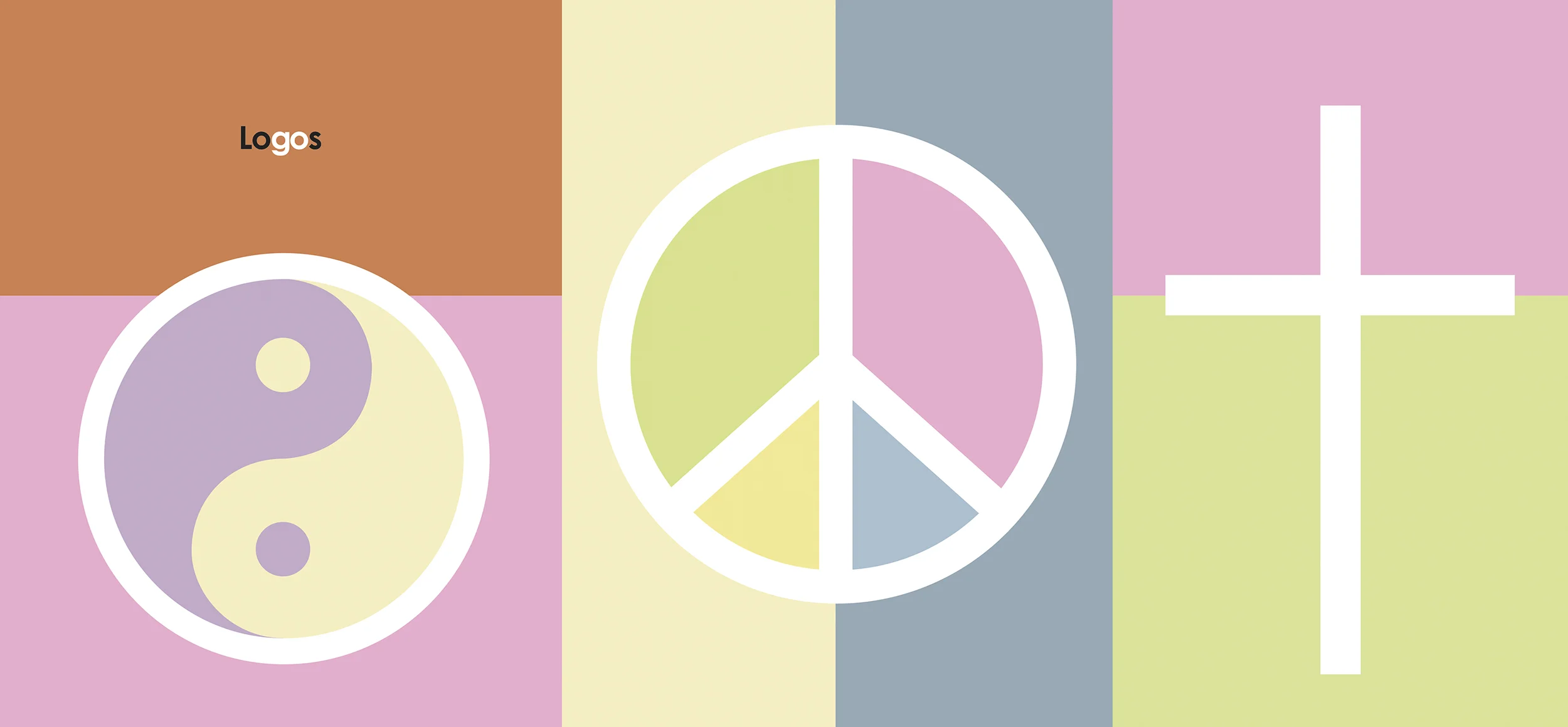
A thousand words.
They say that’s what a picture is worth.
If that’s true, then ‘connect’ must be at the top of the list.
Because that’s what logos do, through the values they uphold and the stories they tell.
That’s all we strive for when creating a logo: connecting our clients to theirs.

Context
Brilinta is a drug developed to treat patients with Acute Coronary Syndrome (ACS - or SCA in Portuguese).
As part of the its launching strategy in Brazil, a campaign was designed in order to raise awareness about ACS among patients and their family members.
A name and a logo were required for this campaign.
Concept
’Second chances’.
Patients who suffered heart attacks frequently reported that life after these events had become less fun and overly restrictive, with friends and family members constantly reminding them of what not to do, what not to eat, etc.
We went for the other side of that very same coin.
Surviving a heart attack was a second chance. To make dreams come true. To right some wrongs. To live fully.
The logo shows a proverbial heart (letters C and A). The slogan reads: a second chance for you and your heart.


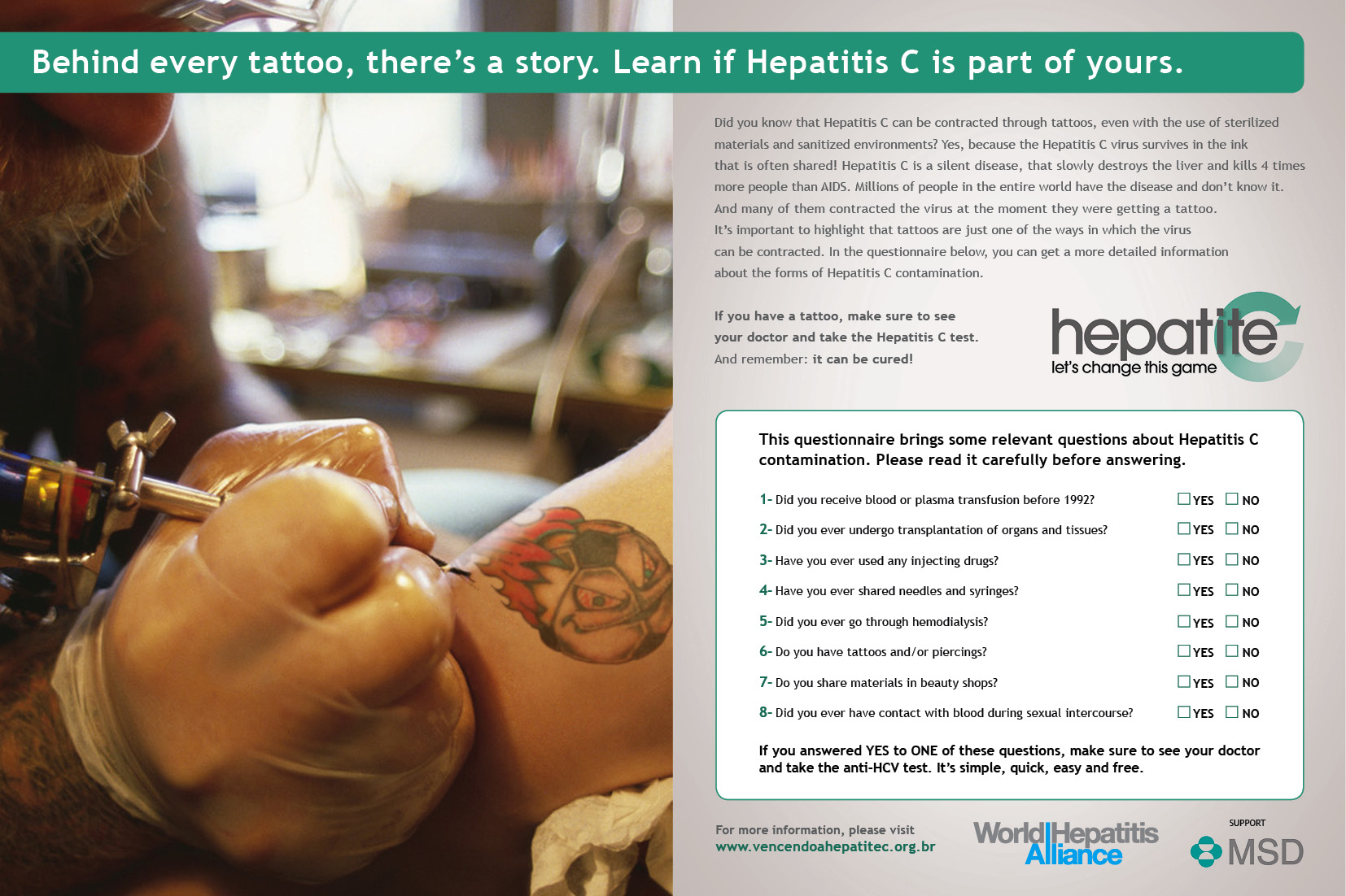

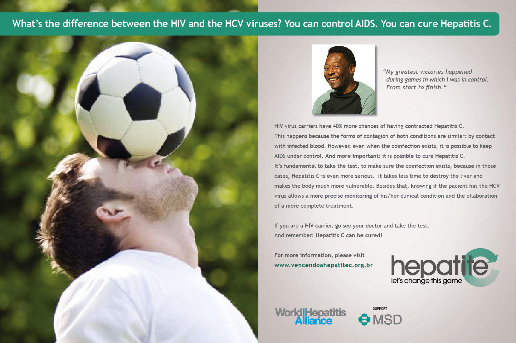
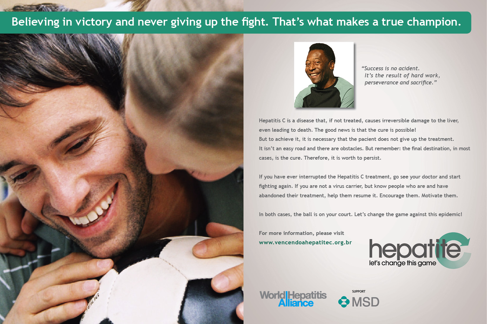
Context
Merck Sharp & Dohme was launching a campaign to raise awareness about Hepatitis C, commonly referred to as the ‘Silent Epidemic’, as its evolution from infection into symptomatic liver disease could take as long as 20 years. The fact that the symptoms took so long to show up led to three main scenarios: 1) People didn’t know they have the disease, 2) People sought no treatment, as there were no symptoms. 3) People abandoned their treatment, as they didn’t feel any improvement (no symptoms). This created a vicious cycle, where the disease continued to be spread out.
We were asked to create a logo, which would later be used as signature to a series of printed ads MSD planned to release as part of this campaign.
Concept
’Game changer’
The concept was born with the purpose of breaking the aforementioned Hep C vicious cycle.
Given that this campaign would be launched during the World Cup, instead of calling out the general public to join a fight against Hep C, we decided to ask them to help us win the game against Hep C. Not only that, but also to change the way the game is played, by being more aware of the ways one could be infected with the virus, how to prevent it and how to treat it.
The letter C of the logo translates the idea of turning things around for the better, winning the game and turning a vicious cycle into a virtuous one.
AVALANCIA


Context
Avalancia is a consulting group from Taubaté, a city near São Paulo. Being a family business, the values of the company reflect those laid out by the clan’s matriarch, the most important one being that, “as a family, we must work together, sharing responsibilities”.
The logo had to convey this message.
Concept
’Divide and conquer'.
Avalancia’s employees had different experiences (from legal to financial). What if these experiences were shared? What if a legal expert gave his/her two cents to a project that only required financial consultancy? Chances are, clients would get a much more well rounded solution. By bringing two mathematical signs together, the logo expresses this sentiment: by dividing every project among its staff, Avalancia’s aimed at multiplying the chances for better results.

Thank you for visiting our logos’ page.
Meet the rest of the family below.


More about us
Contact
Clients & Partners