There are a million ways to talk about one subject.
Make sure yours is the one-in-a-million kind.
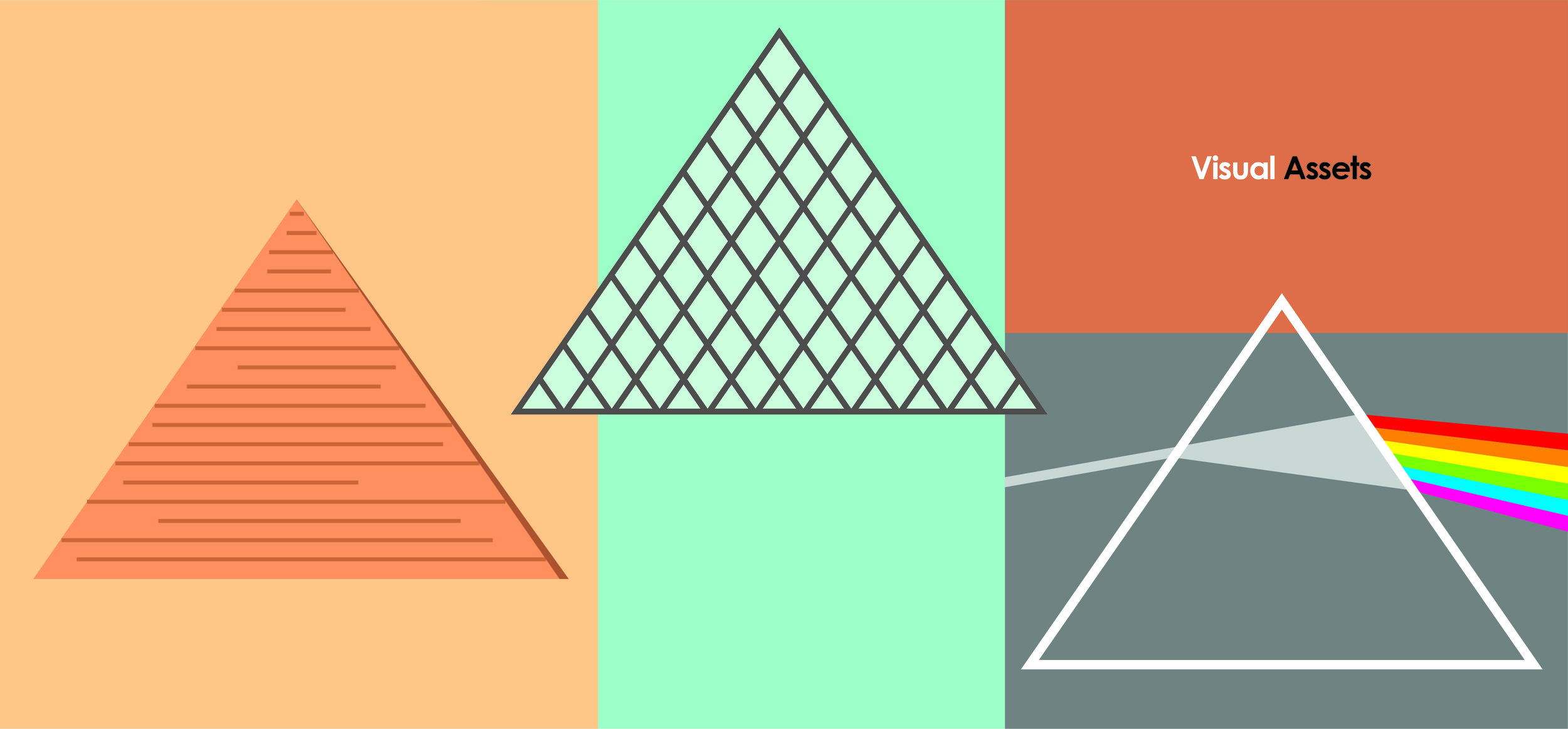
Showtime.
Telling a story is one thing. Showing images of it is, …well, a whole different story.
It feels more emotional. More convincing. More real.
And one very real story is that our clients need to have something to show for their work.
Which is why our job is to make sure the show part is covered.


Context
in 2012, Dow Chemical published out a RFP to select an agency to advertise the fact that, as a Worldwide Olympic Partner, Dow would be providing science-based technologies in multiple Olympic venues - as well as enhancements to the city infrastructure - during the 2016 Olympic Games in Rio de Janeiro.
Because Dow’s presence could be felt in so many areas, from Safety & Construction to Transportation & Advanced Polymers; from Electronics & Imaging to Nutrition & Health, we came up with Key Visuals that resembled printed ads, just so we could cover all these different topics.
Concept
’Human Element’.
It became clear to us that every single one of Dow’s solutions was a product of the company’s complete and undeniable mastery over every single one of the 118 confirmed elements of the periodic table.
But it also became clear to us that it was in fact another element that actually made all the difference: the human element. This element was the single reason behind Dow’s indomitable drive for innovation.
Once we realized that, the concept was born.


Context
AstraZeneca published a global RFP to pick the agency that would be responsible for the communication efforts of the company’s newest drug, Brilinta, prescribed to treat patients with Acute Coronary Syndrome.
They were specifically looking for a concept that could be translated across different languages and cultures.
Concept
’Second chances’.
The thing about surviving a heart attack, according to many ACS patients, is that life starts to unfold in a more tethered manner, filled with restrictions and limitations. The immediate effect of this is that, instead of enjoying the fact that they survived a heart attack with a zest for life, some of these patients claimed that it would have actually been better if they hadn’t survived at all.
Our concept aimed at changing this negative standpoint by 180º, showing that even in dark situations, there can be a lot of light as well.
With our Key Visuals, we decided to tell ‘stories of second chances’: changing careers, rediscovering love and gathering up the courage to follow your dreams.
In the final round of the RFP, three concepts remained: one from the UK, one from Germany, and this one. AstraZeneca selected the Brazilian one.

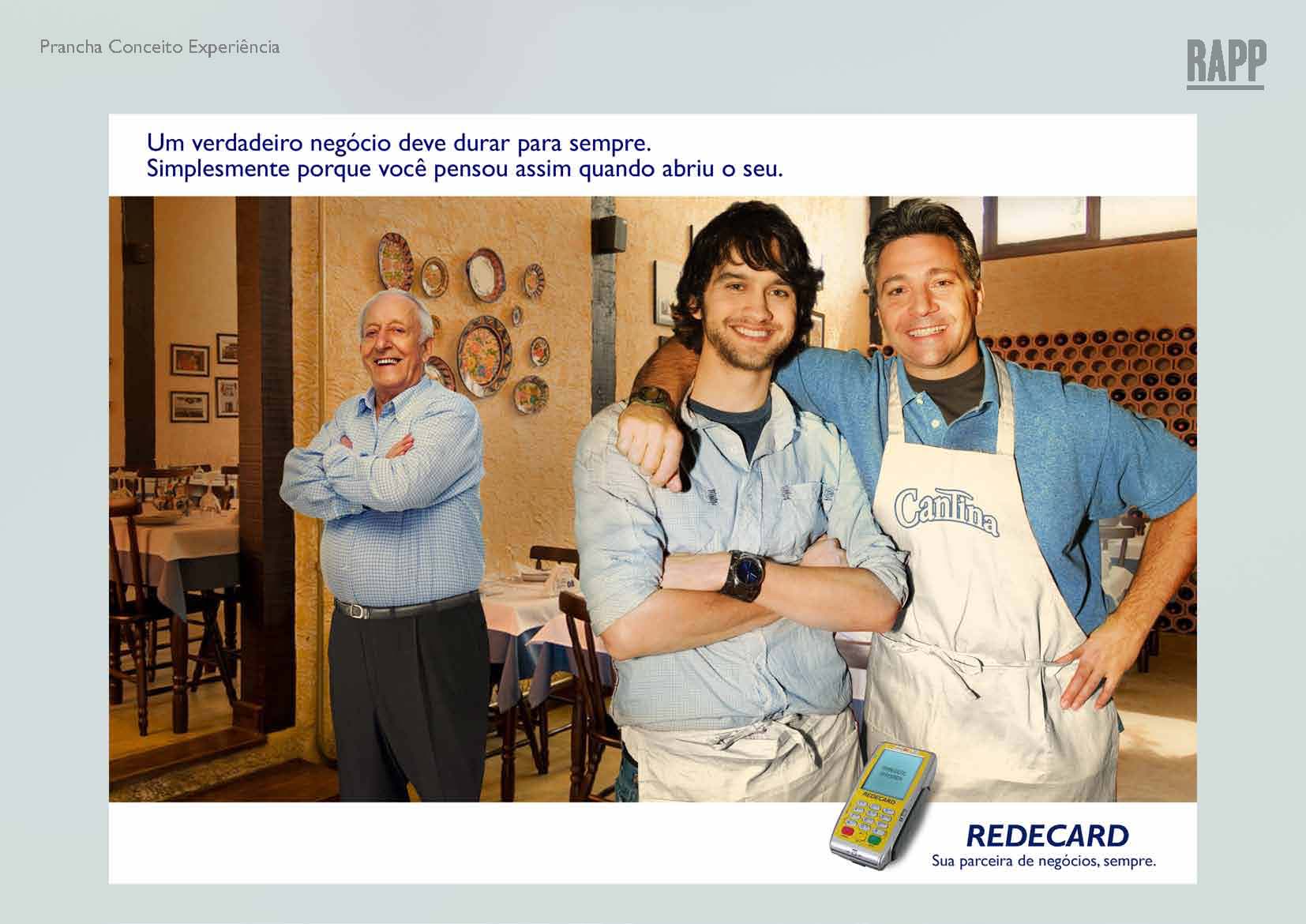


Context
A company in the Itaú Unibanco conglomerate, Rede is responsible for acquiring and processing credit and debit card transactions for Brazilian and international card brands. In collaboration with Rapp, a global communications agency and part of the Omnicom group, we created a concept to answer Rede’s RFP call.
Concept
’Pioneers’.
Rede is a pioneer among firms responsible for capturing, transmitting, processing and settling debit or credit card transactions. Very few (if any) competitors could claim this fact as part of their history.
For merchants to partner up with Rede meant being associated with a company accustomed to being the first: the first to invest in purchases via mobile phone. The first to provide merchants with wireless Point of Sale Terminals. The first to earn the PCI DSS (Payment Card Industry Data Security Standard) certificate in Latin America. In other words, it meant being associated with a company that put the merchant’s needs first.


Context
Audi was about to reveal its new A1 model in Brazil and was looking for a partner to be in charge of the marketing campaign that would later be supporting the launch of the new A1.
Concept
’The next big thing’.
Addressing the A1 model (and its small dimensions) as the next big thing was clearly an oxymoron, and that’s exactly where the concept came from. Along the lines of ‘great things come in small packages’, this concept led to a series of boards showcasing all the ramifications that could be explored, from websites to no media impacts to launching events.
Appreciating the little things in life in a big way. Realizing how a small detail can make a big difference. These juxtapositions between small and big was at the core of this concept, illustrating that the A1 model, while tiny and small, was still an Audi, and in that sense, larger than life.


Context
Dramin is an over-the-counter antiemetic used to treat motion sickness and nausea. It’s been in the market for decades, which posed a problem for the company, as prescribing doctors had no interest in learning anything about the product, which led to the number of prescription to drop further and further.
In an effort to try and reverse this situation, Takeda launched a new pharmaceutical form for Dramin and we came up with Key Visuals to help explain the concept we believed could help Takeda achieve its goal.
Concept
’Classic’.
Standing the test of time, that’s the ultimate test. Legacies stand the test of time. They get passed on from one generation to the other. Being ageless, that’s what separates something deemed as old from something widely accepted as classic. And that’s where our concept came to be.
Within the antiemetic category, Dramin should be seen as the absolute classic. Just as the jeans came to be in in the fabric and cloth realm: something that never goes out of style, even if changes in its form happen.

Our concepts come in other shapes and forms, too.
Let us show them to you.


More about us
Contact
Clients & Partners